- Intro
- What is content reflow?
- What is critical inline CSS?
- Shortcomings of current solutions
- Content reflow fix: CSS inline sizes
- CSS inline sizes demo
- Demo video
- Links
- How to use
- Media queries
- Demo layout CSS
- Placeholder graphic
- Images need a reference
- Lazyload
- Image specifications
- Expanding the use of CSS inline sizes
- Browser support
- Conclusion
Having a smooth page load is part of delivering a good user experience (UX) to your audience. By implementing a content reflow fix on your webpage, you can ensure that users are introduced to your content and brand in the best possible manner.
A smooth initial loading experience is vital for engaging new visitors and optimizing for search engines (SEO). That’s why it is essential to minimize any potential time wastage for users, every millisecond counts!
Also, the content reflow issue becomes particularly problematic when following anchor links that should navigate to lower sections of a long page with numerous images. The reason is that the page position can be disorienting and users may need to re-navigate or leave altogether.
To help address these issues, I have compiled an article on how to fix content reflow.
What is content reflow?
Content reflow in web development refers to the issue where the dimensions or positions of elements on a webpage change as it is being loaded. This causes the content to reflow or shift on the page and potentially disrupt the user experience.
What is critical inline CSS?
Critical inline CSS is code that helps render the webpage layout as fast as possible before all the assets and content are loaded. The idea is to be able to reduce layout variations when loading the page.
Furthermore, it is called inline because the CSS that first renders the page is included in the initial HTML document received by the browser.
Shortcomings of current solutions
Current solutions for addressing the content reflow issue with images include specifying the width and height attributes in the ‘<img>’ tag, or utilizing the CSS aspect ratio boxes fix for responsive images.
The thing is that if you want to display images using art direction, where different aspect ratios are needed for different screen sizes, the existing fixes are not sufficient.
The width and height attributes on <source> is a good solution but limited to recent browsers. If you need wider browser support then you won’t be able to use this method.
Content reflow fix: CSS inline sizes

CSS inline sizes is a CSS technique used as a content reflow fix for images displayed on your web pages. It makes the page load smoother because the image sizes are considered part of the critical inline css. You may use this technique in:
- Static regular images
- Responsive images that fill the container
- Art directed images to display a completely different image per media query rule.
- Images with multiple resolutions, 2x and such
- Any mix of the options above
Code for art directed images
HTML
<figure class="ixi-picture" data-id="img-1">
	<picture class="ixi-picture__picture ixi-picture__placeholder">
		<source media="(min-width: 1025px)" srcset="imgs/1-large-landscape.png, imgs/1-large-landscape@2x.png 2x">
		<source media="(min-width: 700px)" srcset="imgs/1-medium-landscape.png, imgs/1-medium-landscape@2x.png 2x">
		<source media="(max-width: 699px)" srcset="imgs/1-small-square.png, imgs/1-small-square@2x.png 2x">
		<img alt="" class="ixi-picture__img" src="imgs/1-small-square.png">
	</picture>
</figure>
CSS
/* IMG placeholder graphic */

.ixi-picture__placeholder {
   background-color: #ffffd9;
   display: inline-block;
}

/* Media queries for image sizes */

[data-id='img-1'] .ixi-picture__img {
	height: 325px;
	width: 325px
}

@media only screen and (min-width: 700px) {
	[data-id='img-1'] .ixi-picture__img {
		height: 410px;
		width: 600px
	}
}

@media only screen and (min-width: 1025px) {
	[data-id='img-1'] .ixi-picture__img {
		height: 700px;
		width: 1024px
	}
}
Code for responsive images + art directed images
HTML
<figure class="ixi-picture ixi-picture--fluid" data-id="img-8">
	<picture class="ixi-picture__picture ixi-picture__placeholder">
		<source media="(min-width: 1025px)" srcset="imgs/8-large-landscape.png, imgs/8-large-landscape@2x.png 2x">
		<source media="(min-width: 700px)" srcset="imgs/8-medium-landscape.png, imgs/8-medium-landscape@2x.png 2x">
		<source media="(max-width: 699px)" srcset="imgs/8-small-square.png, imgs/8-small-square@2x.png 2x">
		<img alt="" class="ixi-picture__img" src="imgs/8-small-square.png">
	</picture>
</figure>
CSS
/* IMG placeholder graphic */

.ixi-picture__placeholder {
   background-color: #ffffd9;
   display: inline-block;
}

/* Fluid picture */

.ixi-picture--fluid {
	display: flex;
	align-items: stretch;
	justify-content: center;
	flex-direction: column;
}

	.ixi-picture--fluid .ixi-picture__picture {
		align-items: center;
		display: inline-flex;
		margin: 0 !important;
		max-width: 100%;
		max-height: 100%;
		min-width: 100%;
		min-height: 100%;
		position: relative;
	}

	.ixi-picture--fluid .ixi-picture__img {
		min-width: 100%;
		min-height: 100%;
		height: 100%;
		position: absolute;
		top: 0;
		left: 0;
	}

/* Media queries for image sizes */

/* Image size is 325x325 */

[data-id='img-8'] .ixi-picture__picture {
	padding-top: calc( (325 / 325) * 100%);
	width: 325px;
}

@media only screen and (min-width: 700px) {

	/* Image size is 600x410 */
	[data-id='img-8'] .ixi-picture__picture  {
		padding-top: calc(410 / 600 * 100%);
		width: 600px
	}

}

@media only screen and (min-width: 1025px) {

	/* Image size is 1024x700 */
	[data-id='img-8'] .ixi-picture__picture {
		padding-top: calc(700 / 1024 * 100%);
		width: 1024px
	}

}
CSS inline sizes demo
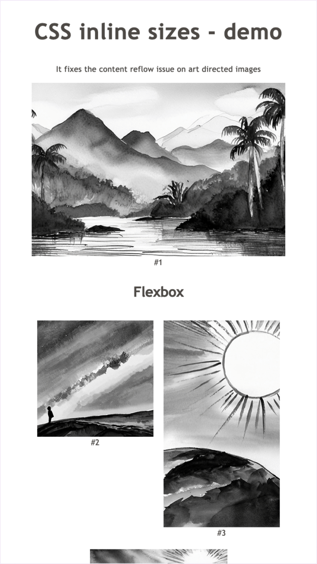
As an illustration, I created two demo pages available for you to check out. The first one is a regular page load where all images are included as part of the initial load. The second one uses Lazysizes to lazyload the images, meaning that images load only when needed and after the initial page load has occurred.
Demo video
Regular load: 00:00
Lazyload: 02:10
Links
Demo with regular page load Demo with Lazyload
The demo files are in Github as well:
https://github.com/alberto-torres/css-inline-sizes/
How to use the demo
To test the loading sequence please do the following:
- Load the demo in your web browser
- Lower your bandwidth using the inspector tool on your browser and reload the page
- Use the responsive design mode to resize the screen as the page loads
- Disable your cache if you want reload page and test again
The demo video is available here.
Media queries
As you play around with the demo, you’ll see that the correct layout will display even if the screen size is changing as the page loads. The demo uses different media queries for different screen widths. These are:
/* Extra small size */
/* (max-width: 300px) - used in imgs to display something decent if screen is extremely small */

/* Small size */
/* (max-width: 699px) - used in <source> to enforce media query */

/* Medium size */
@media only screen and (min-width: 700px) {}

/* Large size */
@media only screen and (min-width: 1025px) {}

/* Extra large size */
@media only screen and (min-width: 1200px) {}
Demo layout CSS
The demo includes CSS code for the different layouts shown. These are:
- Large image, hero style
- Flexbox layout for different image sizes
- A fluid container with a responsive/art-directed image
- A floated image as part of a paragraph text
This code is just for demo purposes and it is not required for the CSS inline sizes fix.
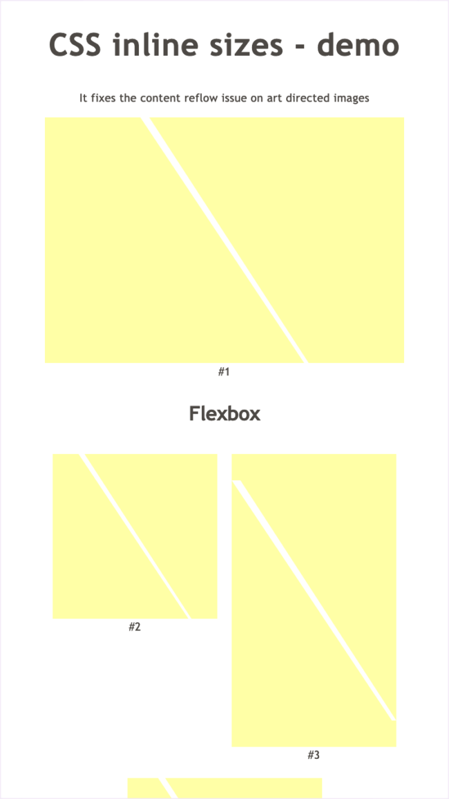
Placeholder graphic
A simple placeholder graphic to let the user know that an image will eventually load in there. Please feel free to modify it and make it fit your visual identity.
The CSS code is being referenced via the ixn-picture__placeholder class in the <picture> tag. Below is the CSS:
/* Placeholder graphic */

.ixi-picture__placeholder {
	background: #ffffa6 url("data:image/svg+xml;base64,PHN2ZyB4bWxucz0iaHR0cDovL3d3dy53My5vcmcvMjAwMC9zdmciIHZpZXdCb3g9IjAgMCAxNjMuMzkgMjM4LjI1Ij48ZGVmcz48c3R5bGU+LmF7ZmlsbDojZmZmO308L3N0eWxlPjwvZGVmcz48cGF0aCBjbGFzcz0iYSIgZD0iTTE1OSwyMzguMjUsMCwwSDguNjdMMTYzLjM5LDIzOC4yNVoiLz48L3N2Zz4=") left top  no-repeat;
	background-size: 100% 100%;
	display: inline-block;
}
Images need a reference
To be able to provide custom sizes for each image you need a way to reference them by a unique identifier. In the demo, we use the data attribute in the outer tag. I believe this is the most unobtrusive way.
HTML
<figure class="ixi-picture" data-id="img-1">CSS
[data-id='img-1'] .ixi-picture__img {}Lazyload
Most modern websites will use a lazyload technique. The demo uses Lazysizes to support art direction. To use lazysizes add the following code to your critical inline css:
/* Lazyload */
.lazyload, .lazyloading {
	opacity: 0;
}
Also, update your HTML according to your lazyload implementation. For this case:
- Change the attributes src and srcset to data-src and data-srcset.
- Add the lazyload class to all <img> tags
In addition, please include the CSS and JS files required, you may get them from the Github repo.
<link rel="stylesheet" href="lazyload.css"><script src="lazyload.js"></script>Image specifications
Below is a table with all the different images used in the demo. For example, the image with the ID 1 is served in 3 different screen sizes, have different aspect ratios and support 1x and 2x resolutions.
| Image ID | Screen size | Image size (px) | Resolutions |
|---|---|---|---|
| ID: 1 | Screen size: small | Image size (px): w 325 x 325 h | Resolutions: 1x, 2x |
| ID: 1 | Screen size: medium | Image size (px): w 600 x 410 h | Resolutions: 1x, 2x |
| ID: 1 | Screen size: large | Image size (px): w 1024 x 700 h | Resolutions: 1x, 2x |
| ID: 2 | Screen size: small, xlarge | Image size (px): w 325 x 325 h | Resolutions: 1x, 2x |
| ID: 2 | Screen size: medium | Image size (px): w 275 x 275 h | Resolutions: 1x, 2x |
| ID: 3 | Screen size: small | Image size (px): w 325 x 578 h | Resolutions: 1x, 2x |
| ID: 3 | Screen size: medium | Image size (px): w 275 x 489 h | Resolutions: 1x, 2x |
| ID: 3 | Screen size: xlarge | Image size (px): w 325 x 578 h | Resolutions: 1x, 2x |
| ID: 4 | Screen size: small | Image size (px): w 325 x 325 h | Resolutions: 1x, 2x |
| ID: 5 | Screen size: small | Image size (px): w 273 x 325 h | Resolutions: 1x, 2x |
| ID: 5 | Screen size: medium | Image size (px): w 383 x 351 h | Resolutions: 1x, 2x |
| ID: 5 | Screen size: large | Image size (px): w 450 x 280 h | Resolutions: 1x, 2x |
| ID: 6 | Screen size: small | Image size (px): w 200 x 70 h | Resolutions: 1x |
| ID: 7 | Screen size: small | Image size (px): w 325 x 325 h | Resolutions: 1x, 2x |
| ID: 7 | Screen size: medium | Image size (px): w 400 x 280 h | Resolutions: 1x, 2x |
| ID: 7 | Screen size: large | Image size (px): w 350 x 500 h | Resolutions: 1x, 2x |
| ID: 8 | Screen size: small | Image size (px): w 325 x 325 h | Resolutions: 1x, 2x |
| ID: 8 | Screen size: medium | Image size (px): w 600 x 410 h | Resolutions: 1x, 2x |
| ID: 8 | Screen size: large | Image size (px): w 1024 x 700 h | Resolutions: 1x, 2x |
Expanding the use of CSS inline sizes
I have implemented this technique in various advanced elements such as image galleries, image sliders, modal boxes, and even combined it with JavaScript. To see an example, check out this page.
Browser support
The technique is pretty basic and it is supported widely (media queries, data attribute). Although, if you are using the CSS aspect ratio fix you’ll need support for the calc() CSS property.
Conclusion
With CSS inline sizes you may fix the content reflow issue for advanced images in a wide range of browsers. This improves the user experience and search engine optimization by offering a smooth first load.
CSS inline sizes involve the use of HTML and inline CSS to assign specific width and height values to different image sizes. This approach supports art direction, responsive images, and accommodates various screen resolutions such as 2x, 3x, and beyond.